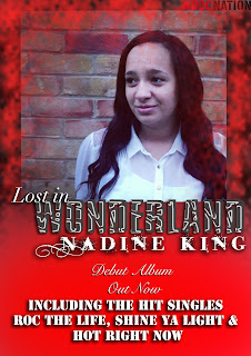
I think that my second attempt (picture on the top) is more conventional of the R&B genre as it has the recognizable "Roc Nation" label which is known world-wide as an R&B label and I've also kept in theme with the red and black which are very strong colours and have connotations of confidence and boldness. This is typical of an R&B artist as generically they aren't as 'feel good' or fluffy as female Pop artists who perhaps use pinks and lilacs like Katy Perry and Miley Cyrus. I've also put the face of the artist onto the advert which is conventional as the audience are given the opportunity to familiarize themselves with who the artist who is producing the music, especially since they're up and coming and haven't got an established image as of yet.
I think the audience will definitely be able to relate to the artist as the strong colours of red and black connote edginess which moves them away from the assumptions of a possible bubbly, pop artists and hints at the type of music that'll be on the album if they were to purchase it. The fact that the album cover is also on the poster shows that she is a rising artist rather than established.
If I were to put this advert into a magazine I think it'd be in one such as the B&S (Blues and Soul) magazine which usually has rising R&B stars on the cover, for example Rita Ora who once appeared on it before the release of her song "R.I.P" which Tinie Tempah also featured on. This choice of magazine would also be conventional because our artist is the typical artist you'd find in B&S which automatically reaches out to our target audience. However, if I could change my advert, I think I'd dress our artist more conventionally, for instance in more "street" or fashionable clothes with jewelry where people can straight away look at our artist and recognize or assume that she's from the R&B genre.
While creating both of these posters I learned a lot of general skills and ideas on Photoshop, for instance I learned a lot about adding glows and shadows to text which helped me achieve most of the writing on both of the adverts. I managed to get different effects like a cracked look and a glow which contributed to the metaphor of contrast between R&B and Pop. Another technique that I learned whilst doing this was the paint brush- not only did I learn how to layer colours on top of one another but I also learnt how to fade them in and out of one another as shown in the top image. Other than that I've also used how to resize and crop images while keeping their resolution as well as placing them where I want to.
While creating both of these posters I learned a lot of general skills and ideas on Photoshop, for instance I learned a lot about adding glows and shadows to text which helped me achieve most of the writing on both of the adverts. I managed to get different effects like a cracked look and a glow which contributed to the metaphor of contrast between R&B and Pop. Another technique that I learned whilst doing this was the paint brush- not only did I learn how to layer colours on top of one another but I also learnt how to fade them in and out of one another as shown in the top image. Other than that I've also used how to resize and crop images while keeping their resolution as well as placing them where I want to.
My draft assisted me in improving my second advert/poster because it made me consider my layout and how to make it more pleasing to the eye, since while flicking through a magazine, readers don't want blocks and blocks of texts, instead broken and fragmented lines work better and flow, so that the reader can take in one part of information at a time. I also decided to include the album cover on my second and final poster because it helps the readers familiarize with a rising star.

This post demonstrates some understanding of why it is imporant to analyse your own work and to reflect on your designs. You have also considered some of your strengths and why you improved your work.
ReplyDeleteAim to include further detail on the fonts and photoshop skills that you used
You have started to consider some of the styles and skills that you used in photoshop, but you also need to consider the advantages of your skills too.
ReplyDelete